Media Optimisation Configuration
The Media Optimization settings can be found under Configuration > Hyva Themes > Media Optimisation.
System Check
System Check does not provide configuration options, but rather provides details and diagnostics on the resize and conversion libraries installed, such as whether certain features are supported.
The System Check can be found at Configuration > Hyva Themes > Media Optimisation > Platform Compatibility Check > System Check
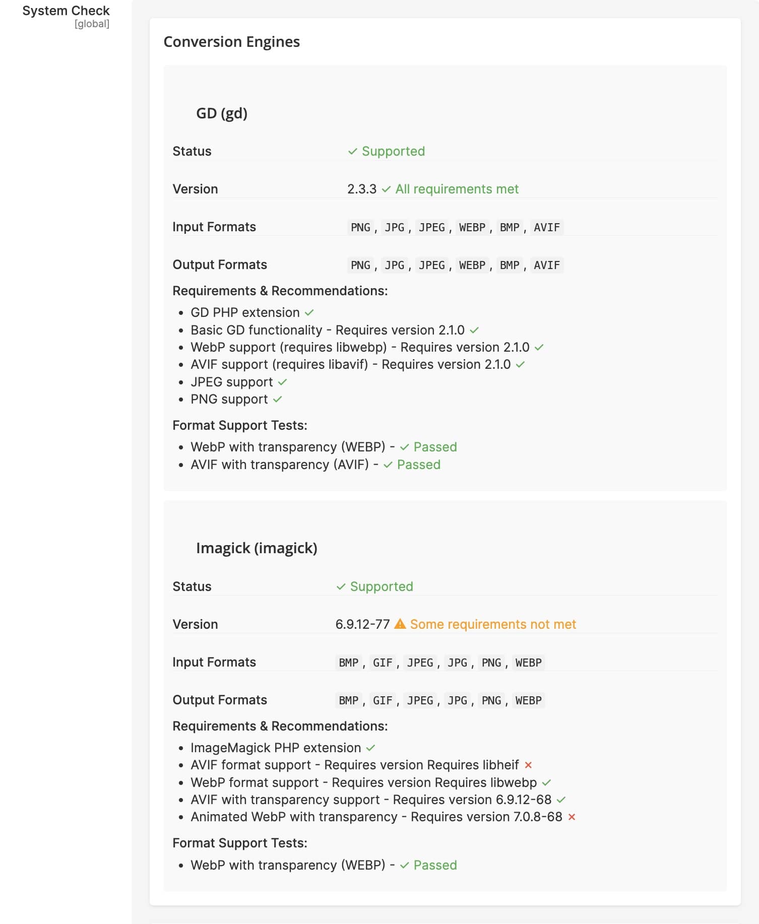
Image Optimisation Settings
These configuration options allow you to enable the overall functionality of Media Optimisation, select engines and outputs used, and enable logging.
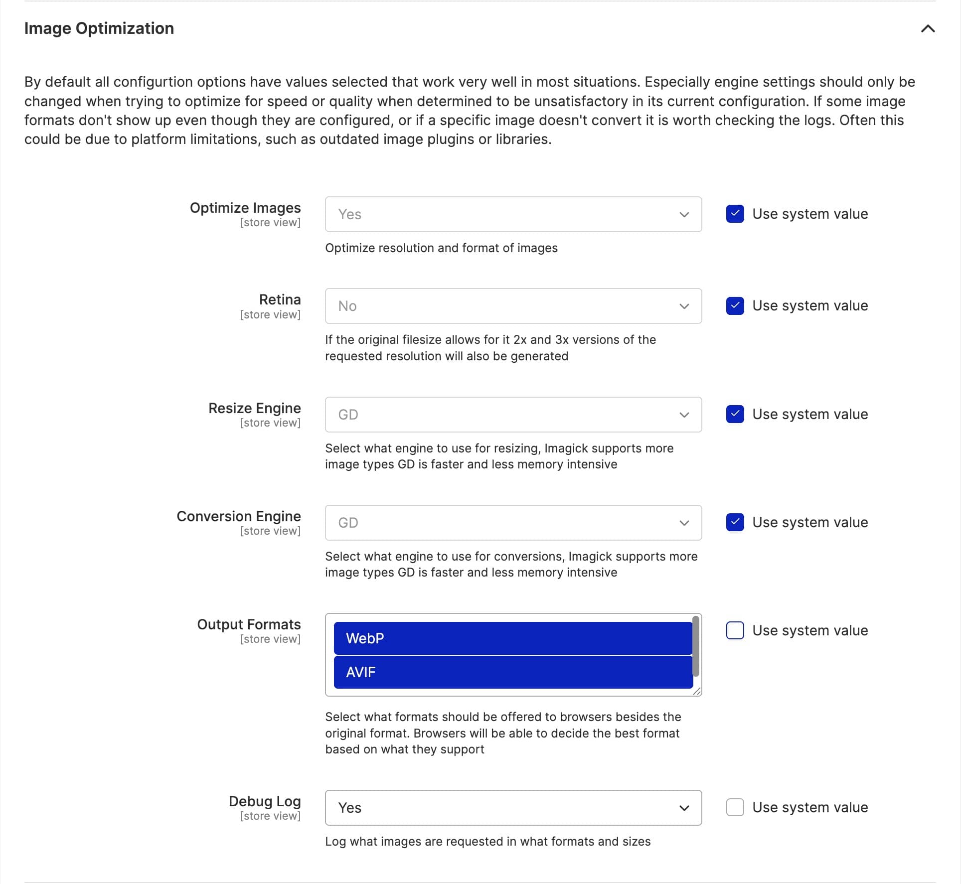
Core Settings
The module ships with defaults that work well for most stores. Enable optimisation and select your desired output formats to get started.
The Retina setting controls whether the module generates 2x and 3x resolution variants for high-density displays. This improves image quality on modern devices but increases storage requirements and initial processing time.
Format Selection
WebP provides good compression with broad browser support. AVIF offers better compression but requires newer browsers. Consider your browser support requirements when selecting formats.
Automatic Image Replacement Settings
These configuration options allow you to enable/disable automatic image replacement, set the mode used for replacing both HTML (e.g. <img>) and CSS (e.g. background-image), the input formats to target and the final formats to output to.
Replacement Modes
The simple replacement mode maintains HTML structure while updating image URLs, making it the safest option for most sites. Picture mode provides better optimisation but changes the DOM structure, which may affect JavaScript that expects specific elements.
For CSS, simple mode replaces URLs with optimized versions while image-set mode generates modern image-set declarations.
Viewport Breakpoints
Viewport Breakpoints configure responsive image sizing based on viewport width, avoiding unnecessarily large images being sent to smaller screens.
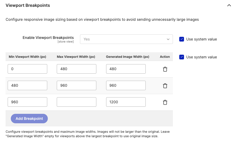
Define breakpoint rows with a minimum viewport width, an optional maximum viewport width, and the generated image width to use for that range. Images will never be generated larger than the original. Leave the Generated Image Width empty for viewports above the largest breakpoint to serve the original image size.
Viewport Breakpoints are applied when using the Developer API or the Automatic Image Replacement feature in picture mode. They are not applied in a simple replacement mode. This feature is the main reason why we recommend using the picture mode over the simple mode - it allows sending much smaller images to mobile browsers.
GD|Imagick Resize|Conversion Engine Settings
These configuration options allow for setting engine-specific quality, compression, encoding speed settings and more.
For detailed information about engine selection, requirements, and when to use each engine, see the Engines documentation.