Menus - Hyvä UI
Hyvä UI provides distinct desktop and mobile menu designs,
optimized for the unique needs of each device type.
This separation ensures a seamless user experience and allows for greater design flexibility across platforms.
The menu structure is purposefully kept minimal to facilitate easy customization and extension.
You can enhance and extend these menus either by integrating third-party modules or by using Hyvä UI Menus, which probably brings you here.
Desktop Menu UI Versions
Hyvä UI offers several versions of desktop menus to cater to various design and functional requirements:
-
A - Simple Static Links:
This version provides a static list for complete control over desktop menu items.
It’s ideal when you prefer independent desktop menu management while using other menu types (e.g., mobile) for category listings. -
B - Column Megamenu:
A traditional mega menu, displaying a top-level item with a panel that reveals nested items in a column format.
This is perfect for organizing content-rich menus. -
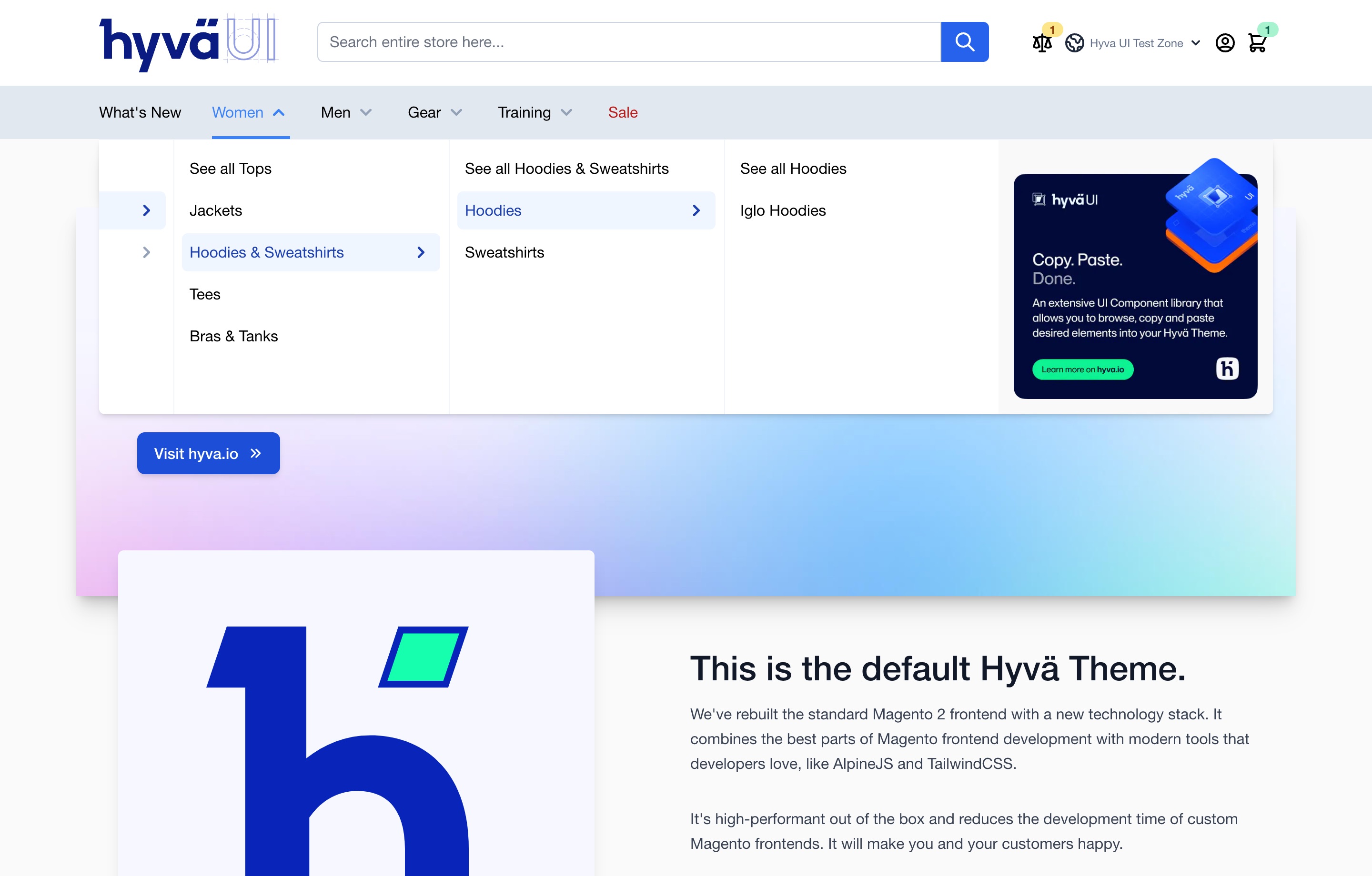
C - Vertical Dropdown (4 Columns):
Designed for deeply nested structures, this drilldown-style menu is similar in appearance to mobile menus.
It allows users to navigate multiple levels of content. -
D - Shop Dropdown:
Similar to the Vertical Dropdown, but consolidates all top-level items under a "Shop" button.
This menu version also supports additional static links for quick access to other sections.
Mobile Menu UI Versions
Hyvä UI offers the following mobile menu designs, tailored for optimal navigation on smaller screens:
-
A - Scroll Menu:
A modern drilldown-style menu that includes features like a search bar and a call-to-action button. -
B - Tabs Menu:
Similar to the Scroll Menu but with the addition of tabs to group items.
This allows for a more compact layout while maintaining easy access to menu options.
Adding Banners to Menus
Many of Hyvä UI’s menus support the inclusion of static blocks or widgets.
This allows you to place additional content, such as banners, within or after the menu,
providing more flexibility in layout and design.
For implementation details and specific examples, refer to the documentation for each UI component.
