Hyvä Banner Widget
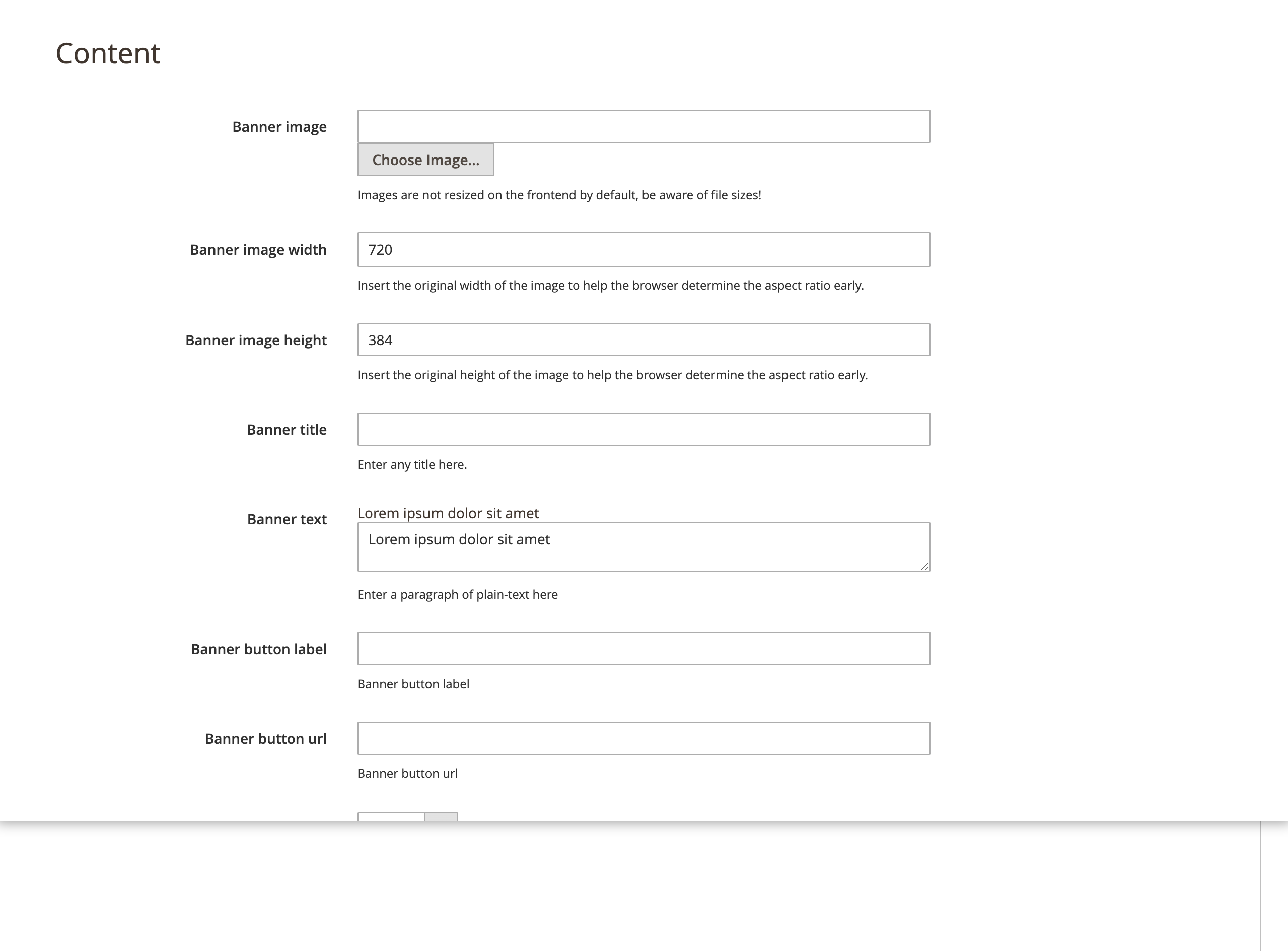
Content Options
- Banner image - Images are not resized on the frontend, be aware of file sizes!
- Banner image width - Insert the original width of the image to help the browser determine the aspect ratio early.
- Banner image height - Insert the original height of the image to help the browser determine the aspect ratio early.
- Banner title.
- Banner text - Enter a paragraph of plain-text.
- Banner button label.
- Banner button url.
- Banner content text alignment - The banner content text alignment can be left, center or right. The default position is left.
- Content text color.
- Content container background.
- Container - Apply container to the widget content. These uses the theme container size. If a different size is needed, add a custom class in your themes
tailwind.config.js. - Banner inner content container - Apply container to the widget inner content. This is used with a removed container on the whole widget to achieve fluid 100% width design of the background and the contained data. It uses the native container sizes for the theme. If a different size is needed, add a custom class in your themes
tailwind.config.js.
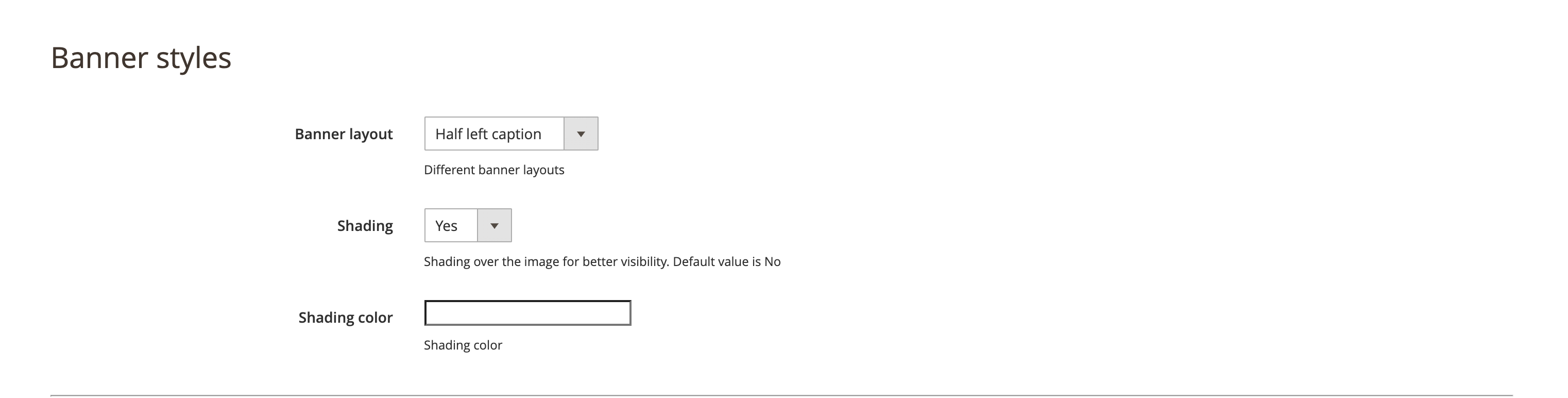
Banner styles Options
- Banner layout - There are three different banner variations.
- Full width - Span the banner edge to edge.
- Half left caption - Contained banner split 50/50. Any content is on the left side of the banner image.
- Half right caption - Contained banner split 50/50. Any content is on the right side of the banner image.
- Shading - Yes/No. If "Yes", a transparent shading is applied to the banner image. Use this to ensure there is contrast between the image and the content.
- Shading color - Color picker for the shading. Will be applied only if the Shading option is set to "Yes".
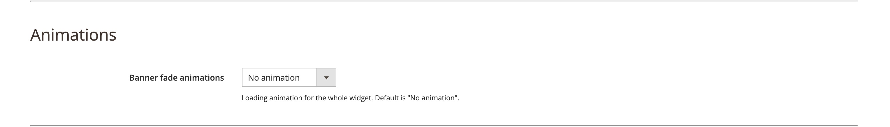
Animations Options
- Banner fade animations - The banner is animated when the visitor scrolls half the element into view. It will disappear or animate out when user scrolls the content out of the view port. There are 10 options available for a user to select from. For more details on how this plugin works on the development side please visit the Intersect plugin Alpine.js documentation.
Note
Animations only work with Hyvä 1.1.10.
Earlier releases of Hyvä do not include the x-intersect plugin.
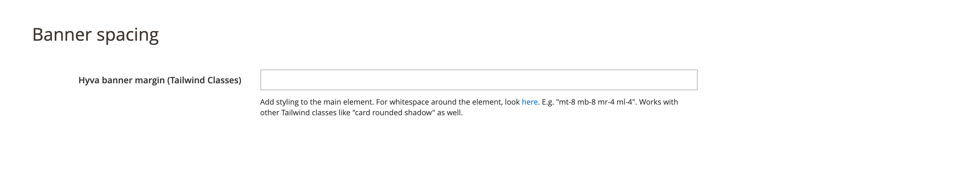
Banner spacing Options
Hyvä banner margin (Tailwind Classes)
This fields allows adding styling to the main element. For whitespace around the element, please refer to theTailwind CSS documentation for Margins.
Example: mt-8 mb-8 mr-4 ml-4.
It is also possible to specify other Tailwind CSS classes like card rounded shadow.