How to Use a Sticky Footer (Positioned at the Bottom of the Screen)
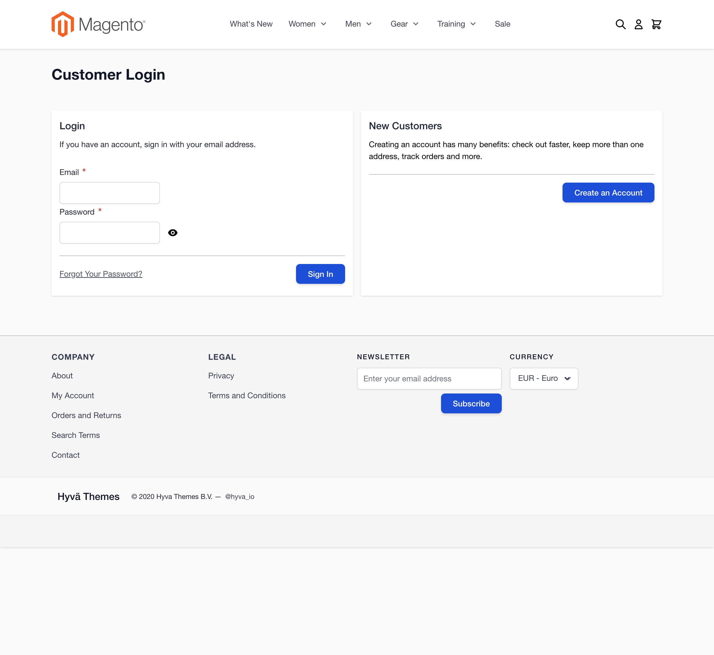
On pages with short content viewed on tall screens, the default theme may display a large empty space below the footer, which can affect the page’s appearance.
If you want the footer to always stick to the bottom of the screen, regardless of the page's content height, you can achieve this with a few CSS adjustments.
Solution: Fix the Footer at the Bottom
To position the footer at the bottom of the screen, even on pages with little content, apply the following steps:
- Modify the
.page-wrapperClass: - Set
min-height: 100vhto ensure the wrapper takes up the full viewport height. -
Use
display: flexandflex-flow: columnto align the content vertically. -
Adjust the
#maincontentClass: - Apply
flex-grow: 1to make the main content section expand and take up any remaining vertical space.
Implementation
To implement this in your theme, add the following XML to the <body> section of the default.xml file
located in your theme directory, such as Magento_Theme/layout/default.xml:
<referenceContainer name="page.wrapper" htmlClass="page-wrapper min-h-screen flex flex-col"/>
<referenceContainer name="main.content" htmlClass="page-main flex-grow"/>
This ensures that the footer will always "stick" to the bottom of the screen, even if there’s not enough content to push it down naturally.
After applying these changes, the footer will appear at the bottom of the page, with any extra space positioned above it, providing a more consistent layout across different screen sizes.