Building Forms
This guide walks you through creating a form in the Hyvä CMS Liveview Editor and adding and configuring its fields.
Creating a Form
- In the admin panel, go to Content > Elements > Forms.
- Click Add New Form. The setup dialog opens, in two steps.
- Step 1, choose the type of form you want to build. Every registered form type is offered here with its own description, so pick the one that matches the form you have in mind.
- Step 2, fill in the details. Give the form a Title and an Identifier, switch
Enable Form on when you want it live, and optionally enter a Recipient (To) and an
Email Subject so the form has somewhere to send to, and a readable subject line, from
the start. The Identifier field formats what you type to the allowed shape, lowercase
letters, digits and underscores, with spaces and hyphens turned into underscores, so
typing "Contact Inquiry" gives you
contact_inquiry.
The Liveview Editor then opens with the form type you chose already in place, ready for fields. Everything else, including the rest of the submission settings, can be set later.
If the form settings fail validation when you save, the editor shows an error message and opens the Form Settings panel with the problem highlighted - a save never fails silently.
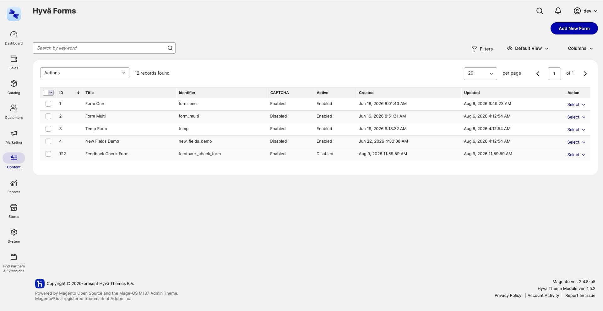
The grid lists every form with its identifier and status, alongside whether CAPTCHA is
on. Switch on Recipient (To), Email Subject and Webhook URL from the Columns
control when you want to see how forms are configured at a glance. None of those four
columns can be edited in the grid, so change the values in Form Settings > Submission.
Use the Select menu on any row to Edit, Duplicate, or Delete a form.
Duplicate asks for confirmation, then creates a disabled copy titled "… (Copy)" with
the identifier suffixed _copy (_copy_2 if that is already taken) and opens the copy
for editing.
Choosing a Form Type
The type you pick in the setup dialog becomes the form's form root, the component that holds your fields. The types included today:
- Single-Step Form - a single page with one submit button. Best for contact and inquiry forms.
- Multi-Step Form - a wizard that shows one step at a time with Back / Next navigation and a "Step N of M" indicator. Add two or more Form Step containers inside it, one per step, and put fields in each.
A form document holds exactly one form. The form types stay listed in Add a Component while a form root is in place, but adding a second one at the top level is refused with "Cannot add: the maximum number of top-level components has been reached", so the editor won't let you stack two forms in one document. A complete form cannot be dropped inside another form's Form Content container either. To switch a form to the other type, delete the root first, then add the type you want. Deleting the root takes its fields with it.
The form root's own property panel carries the customer-facing settings: the submit button label, the success message and redirect, the reply-to field and conditional recipient routing. The operational settings, recipients, subject and webhook, live in Form Settings > Submission instead. See Sending and Recipients.
Form roots carry no color settings of their own. Colors belong to the content the form sits in: the Hyvä CMS Form component you embed a form with has Background Color and Text Color on its Design tab. See Embedding a Form.
More form types can be added
Single-Step and Multi-Step are the form types included with the Form Builder. Developers and solution integrators can add their own, for example a survey-style root with a progress bar, and it appears in the setup dialog automatically. See Create a Custom Form Root.
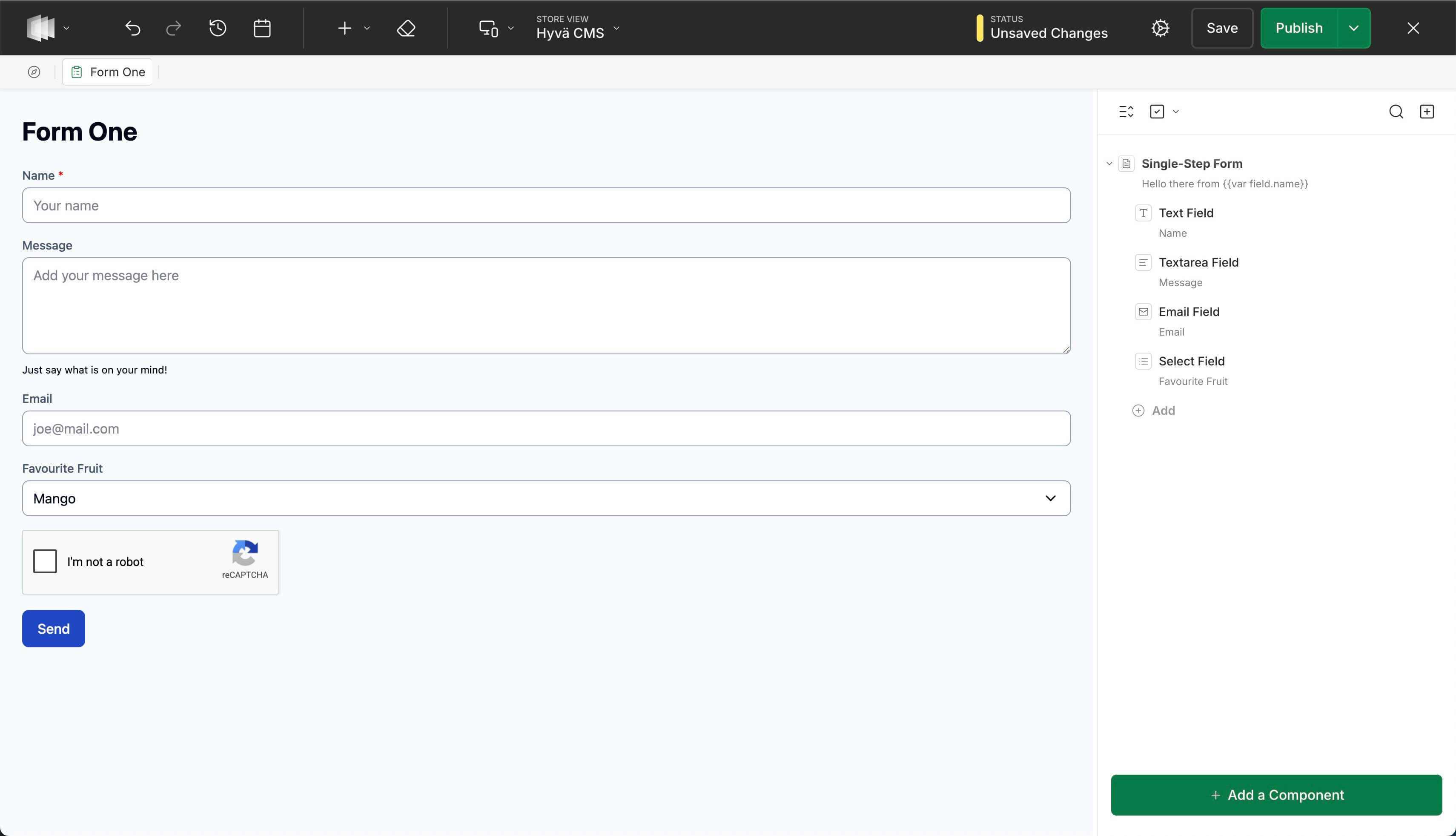
Adding Fields to a Form
The Form Builder includes these field types, which you add from the Add a Component picker once a form root is in place:
| Field | Use it for |
|---|---|
| Text Field | A short, single-line answer - a name or subject line. |
| Textarea Field | A longer message - comments or a description. |
| Email Field | An email address, validated automatically. |
| Phone Field | A telephone number (shows the dial pad on mobile). |
| URL Field | A web address. |
| Number Field | A number, with optional minimum and maximum. |
| Date Field | A date, date-and-time, or time. |
| Select Field | Pick one option from a list you define. |
| Multi-Choice Field | Pick several options from a list. |
| Checkbox Field | A single checkbox, ideal for a consent prompt. |
| Hidden Field | A value captured silently - a campaign ID or source page. |
More field types can be added
These are the field types included with the Form Builder. Developers and solution integrators can add custom field types that behave like the built-in ones. See Create a Custom Field.
Rich Content Inside a Form
A form does not have to be a bare list of fields. Drop a Form Content container into a form (or into a step of a multi-step form) and you can compose regular CMS components around your fields: text, images, columns, cards, and HTML, the same components you use on pages and blocks.
Typical uses:
- An introduction - a heading and a short paragraph above the fields explaining what the form is for and what happens after submitting.
- Side-by-side layouts - place a Grid or Columns component inside the container to put content next to fields, such as contact details or opening hours beside an inquiry form.
- Rich content between fields - imagery, legal text, or a card that breaks a longer form into visually distinct groups. Fields can sit inside the container too, so a group of fields and the content that belongs with it stay together.
The container's property panel controls how the group sits in the form: Width (%) and Max Width (px) decide how much of the form width it takes, and alignment and spacing settings position it. Leave the width empty to fill the form.
Two placement rules apply: a Form Content container cannot be nested inside another one, and a complete form cannot be dropped inside a container.
Configuring a Field's Properties
Click any field in the form canvas to open its property panel on the right. Every Form Builder field has a Label (shown to the customer) and a Field Name (the machine-readable name used in the notification email - leave it blank and one is derived from the label).
Common properties include:
- Required - the customer must fill it in before submitting.
- Placeholder and Help text - guidance shown in and below the field.
- Default value - pre-fills the field.
Some fields add their own options - a Select Field and Multi-Choice Field let you edit the list of choices, and a Number Field lets you set minimum and maximum values.
The property panel's Advanced tab holds validation and browser-assist options:
- Validation Pattern (regex) and Pattern Error Message - on the Text Field, Phone Field and URL Field, a regular expression the value must match, and the message shown when it doesn't.
- Autocomplete - on the Text Field, hints the browser which saved value to autofill into the field. Choose from On, Off, Full name, Given name, Family name, Email address, Telephone number, Organization, Street address, Postal code or Country name. The default, None, adds no autocomplete hint. The Phone, URL and Email fields set their autocomplete tokens automatically.
Field names must be unique
Two fields can't share the same field name. When you publish, the editor warns you and names the field to fix. Drafts allow a duplicate to exist while you edit.
Related Topics
- Sending and Recipients - set who receives submissions, the reply-to address, and the success message.
- Spam Protection - the built-in honeypot and turning on CAPTCHA.
- Testing a Form - send a real test submission from a preview before going live.
- Embedding a Form - put your form on a CMS page or block.
- Hyvä CMS Liveview Editor - saving drafts, publishing, and rolling back with version history all work the same as for CMS pages.